How Can We Help?
This summary allows users to manage their applications efficiently, promptly identify and address issues, and maintain optimal system stability and performance.
Within the Application Summary screen, you can:
- Monitor and analyze application health and performance comprehensively.
- Visualize the Service Dependency Map with external entities, services, and adjacent applications to understand dependencies better.
- Assess the health of services through capsule representations of events at a glance.
- Access detailed information on problems, warnings, and capacity forecasting for informed decision-making.
- Streamline their monitoring experience with search, layout customization, and historical data analysis capabilities.
Application Summary Navigation
In the Application Health Dashboard, click inside an application pod to access the Application Summary screen for a specific application.
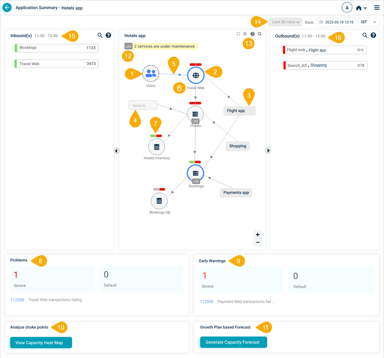
Application Summary
| Field | Description |
|---|---|
| 1 – External Entity | This field represents either an external user or an external service. An external service is an entity that initiates a transaction within the application. The display of this information enables users to better understand the origin of the transactions and the interactions between various components in the system. |
| 2 – Entry Point Service | This field displays an entry point service that directly receives requests from external sources, irrespective of HEAL monitoring. It highlights primary interaction points and shared services across applications for better system understanding. |
| 3 – Adjacent Application | This field showcases services and applications related to the selected application, situated at one arm distance. Upon selecting an adjacent application with access, the user can view its Service Dependency Map (SDM) for deeper analysis and insights. |
| 4 – Restricted Application | This field indicates an application that is currently unavailable for access due to user permissions or restrictions. |
| 5 – Inbound Traffic Indicator | This field represents an inbound connection to a Service, indicating that the service is receiving requests or data from external sources. This provides users with an overview of the service’s incoming interactions and helps to monitor its performance and functionality. |
| 6 – Host and Component Instances | This field displays the total number of host and component instances associated with a service, providing an overview of the service’s infrastructure and deployment. |
| 7 – Event Capsules | This field displays a two-part capsule representing the events of a service. The left part of the capsule corresponds to the health of workload Key Performance Indicators (KPIs), while the right part represents the health of behavior KPIs. The capsules indicate the impact of ongoing signals on the service by displaying different colors based on the events observed. The left and right parts of a capsule can be colored as follows:
The color of the icon inside the circle representing the service remains unaffected even if the Workload or Behavior capsule color is Red. The capsule color serves as an indicator of the events affecting the service. |
| 8 – Problems | Displays the count, IDs, and brief descriptions of active Severe and Default problems within a selected time range. Click on a problem to navigate to the Signals Tab. |
| 9 – Early Warnings | Displays the count, IDs, and brief descriptions of active early warnings within a selected time range. Click on a warning to navigate to the Signals Tab. |
| 10 – View Capacity Heat Map | Analyze transaction trends on an application to determine growth patterns on a cumulative and transactional basis. Corresponding breach metric trends, in terms of anomaly count, can be evaluated to identify workload mixes or clusters causing the most anomalies. Click to navigate to Capacity Heat Map for Application screen. See Viewing Capacity Heat Map. |
| 11 – Generate Capacity Forecast | Generate a trend forecast report for a specific duration of data by calculating the growth trend of transactions during the specified time period. Click to navigate to the Capacity Forecast for Application screen. |
| 12 – Maintenance Service Count | The application displays the service count currently under maintenance. Maintenance can be scheduled for the complete service or specific instances of a service (ad hoc maintenance). Services under maintenance are indicated by a ‘UM’ icon. |
| 13 – SDM Navigation Toolbar | The HEAL agent initiates the Service Dependency Map (SDM), automatically discovering hosts and services to provide a real-time visualization of application dependencies. By mapping connections to external entities, services, and adjacent applications, the SDM offers a comprehensive view of your application ecosystem, significantly improving issue detection and resolution. The toolbar provides users with various icons to help them interact with the Service Dependency Map (SDM) effectively.
|
| 14 – Historical Data Selection | This allows users to view data from a specific date, time, and time zone, providing insights into the application’s performance during the selected time. |
| 15 – Inbound(s) | Displays the transactions that hit the entry point services of an application. |
| 16 – Outbound(s) | Displays the transactions that go outside the application. |
Next Steps
Learn about the Signals Tab.
Explore the capabilities of Capacity Heat Map for Application.
Gain insight into the process of Generating Capacity Forecast for Application.