How Can We Help?
Services can optionally be tagged into applications by admins via back end. Purpose of an application health dashboard is to show whether any of the configured applications have ongoing signals. There can be multiple applications in a customer environment and can span services built on monolithic or cloud-native architectures. An application serves as a unit whose behavior needs to be watched. Application health dashboard is a simple dashboard that can be projected on a large screen or wall. It displays data to show whether an application is in trouble. Application status color and width is visible from 20-30 feet distance.
Application Health Dashboard
When you login to HEAL, Application Health Dashboard (CXO Dashboard) is the default landing screen.
You can access application health dashboard provided :
1. Admin has configured at least one application and tagged services to it.
2. Data collection and processing is ongoing for configured applications.
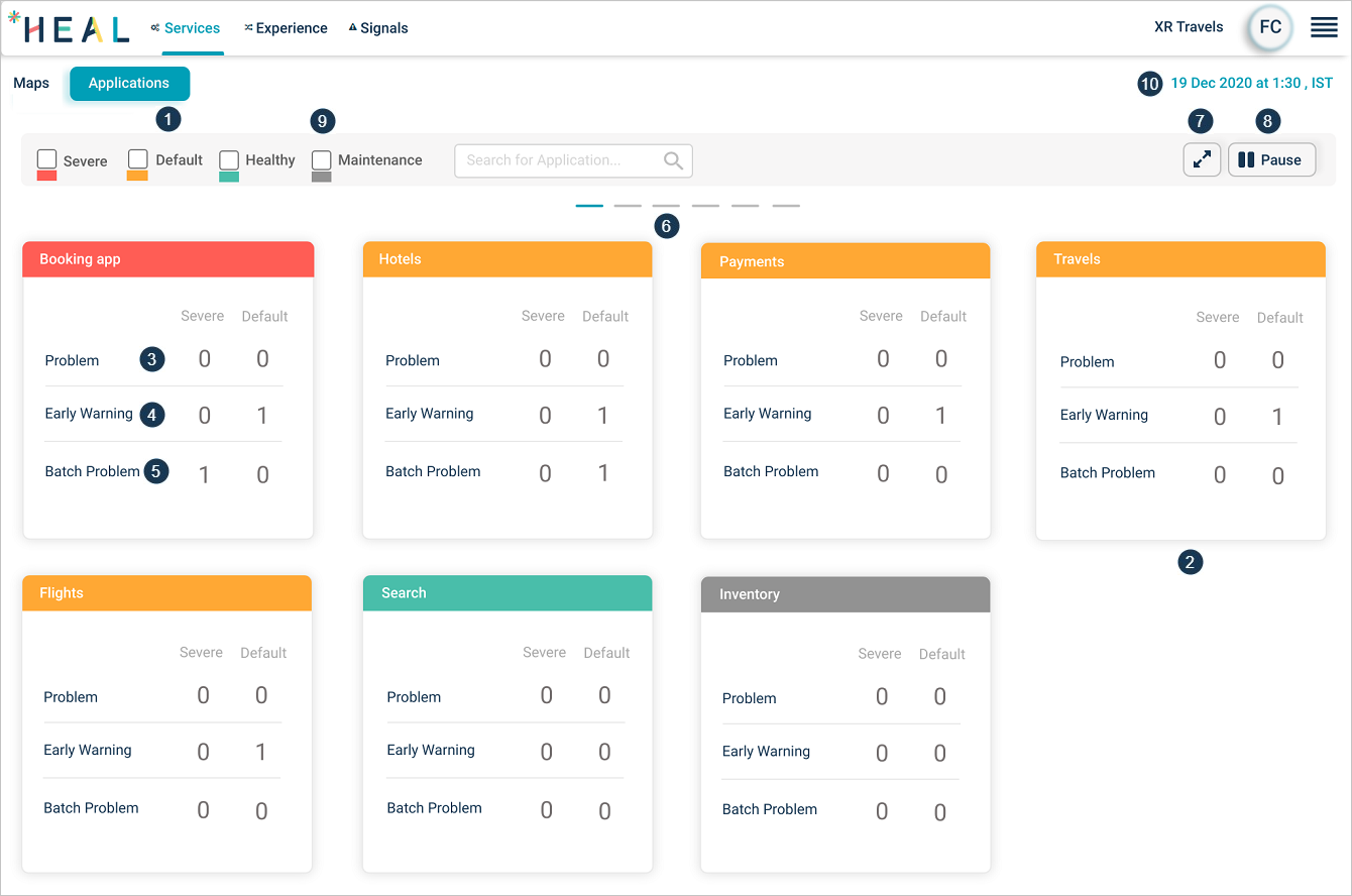
Application Health Dashboard
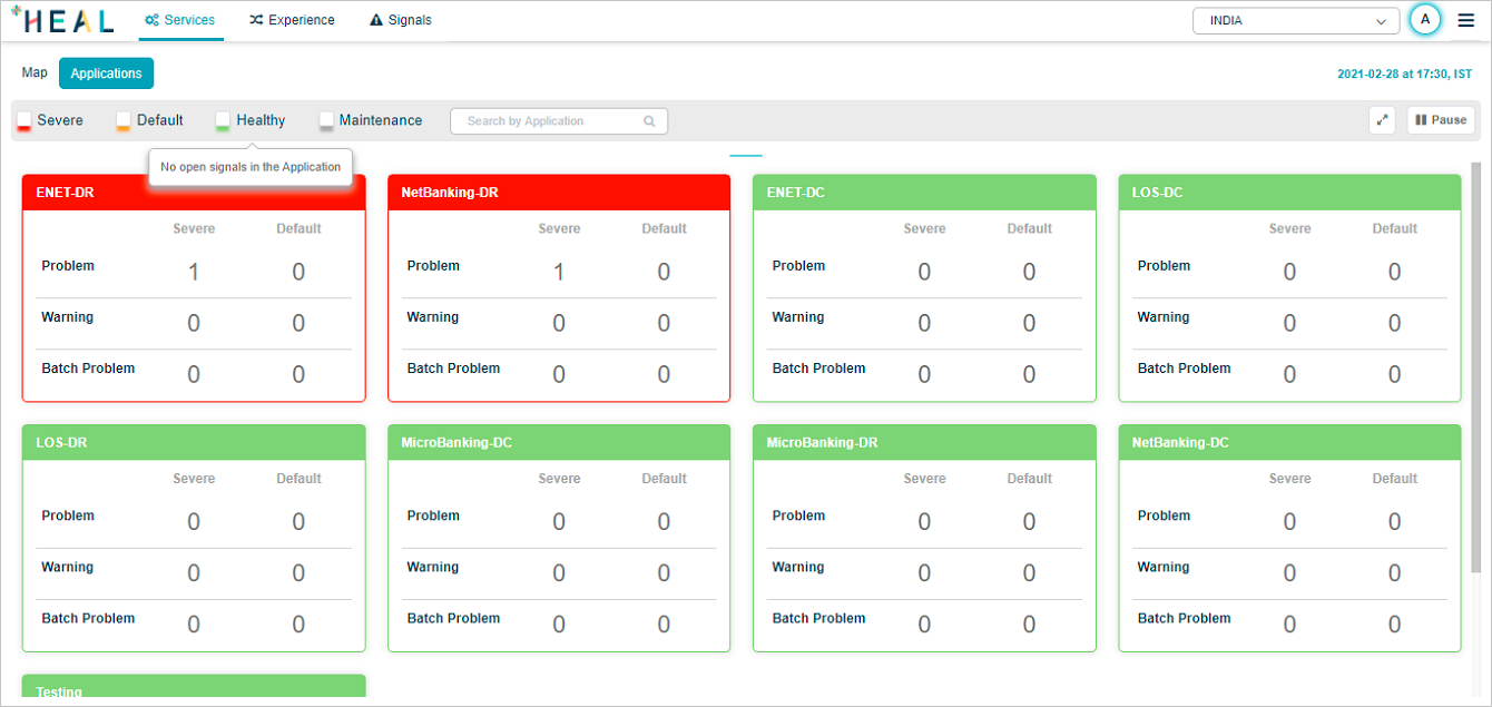
| 1 | An application is a set of services grouped together. Select Applications to view Application Health Dashboard screen. It shows summary of all configured applications. You have access to only those applications assigned to you. You can view only those applications in the dashboard. |
| 2 | An individual application. A pod represents an application. Color of the top line of a pod represents status of the respective application. Green – Application without any signal(s), Yellow – Application with Default signal(s), Red – Application with Severe signal(s), Gray – Application under maintenance. |
| 3 | It displays whether an application has signals or not. It displays count of active Severe and Default problems. Select anywhere in the block to navigate to Application Health Summary Screen for the application. |
| 4 | It displays count of active Severe and Default warnings. Select anywhere in the block to navigate to Application Health Summary Screen for the application. |
| 5 | It displays count of active Severe and Default batch problems. Select anywhere in the block to navigate to Application Health Summary Screen for the application. |
| 6 | Select on the lines to scroll the screen horizontally. |
| 7 | Select the icon to enter full screen mode. Press Esc in full screen mode to come to normal mode. |
| 8 | Applications rotate as a carousel. 12 applications are displayed on one page. This icon toggles between Play and Pause. Select Play to start screen rotation. Screen keeps rotating unless you select Pause. |
| 9 | You can filter applications based on their status. Select the status box to display applications belonging to respective status only. |
| 10 | This displays just in time (snapshot time). |
You remain logged in once you navigate to Application Health Dashboard even without any activity on the dashboard. When you navigate to other screens, session timeouts after the configured timeout interval in KeyCloak.
Disabled Batch
If you disable a batch, CXO dashboard is displayed as follows. In this case, Batch Problems are not applicable.
Disabled Batch
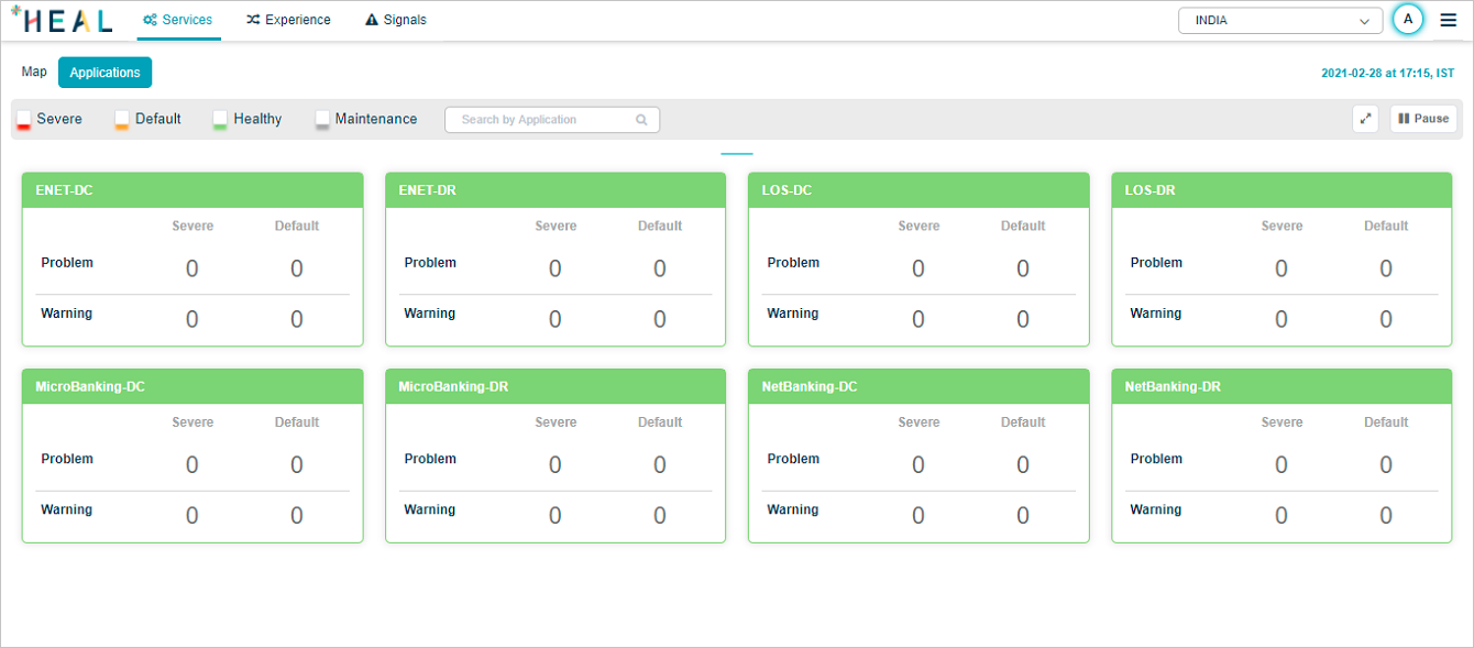
Application Status
Hover over the status pods to view the significance of the status:
1. Severe
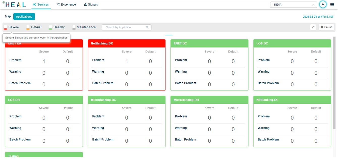
Severe Application Status
2. Default
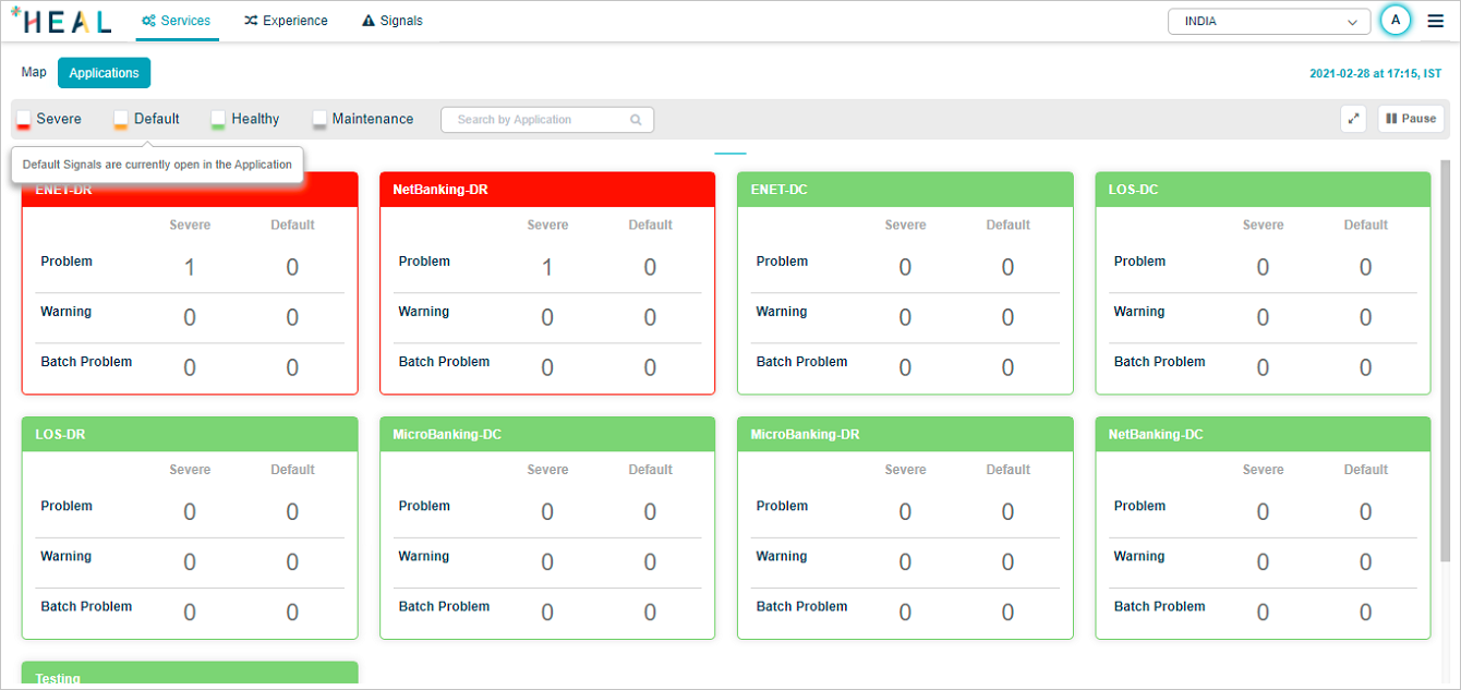
Default Application Status
3. Healthy
Healthy Application Status
4. Maintenance
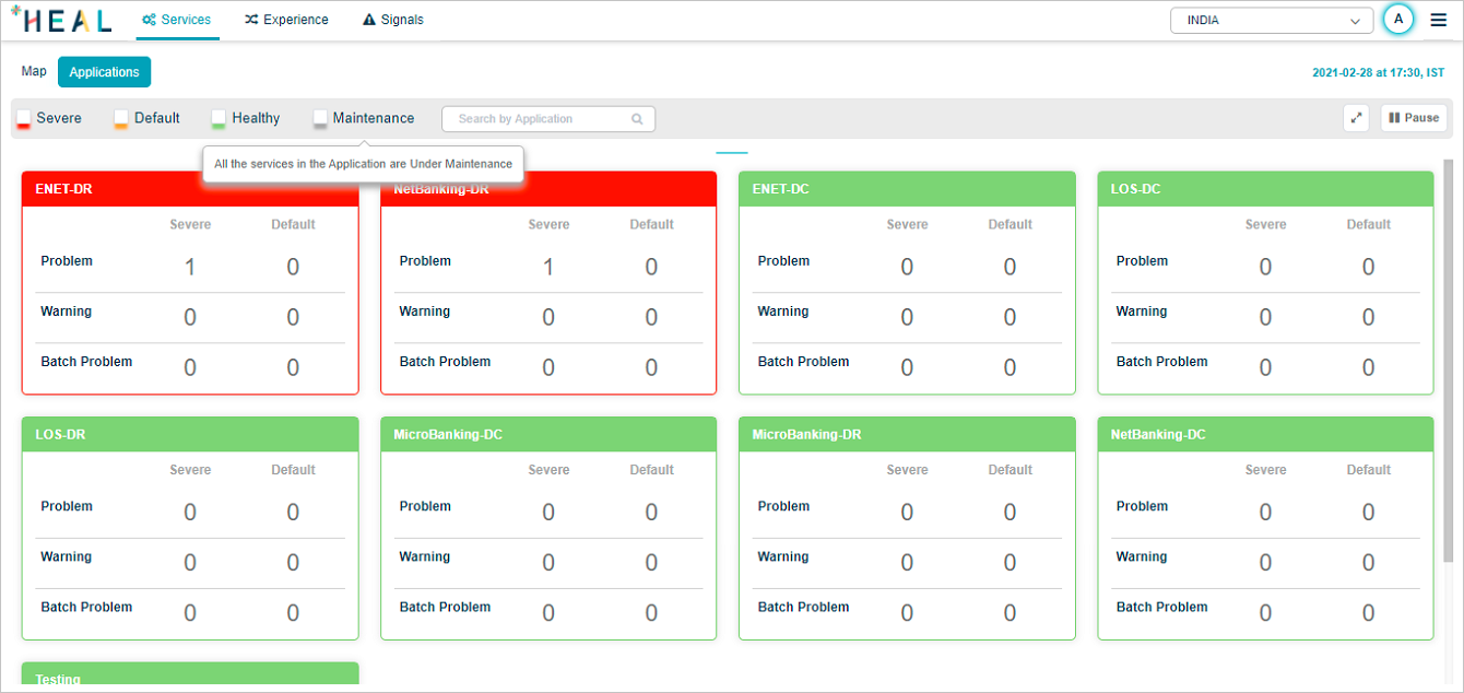
Maintenance Application Status
Ordering of Application Pods
Application pods are sorted in the order of Red, Amber, and Green. If multiple pods are Red, they are sorted in descending order of number of Severe signals. If multiple pods are Amber, they are sorted in descending order of number of Default signals. If multiple pods are Green, they are sorted in alphabetical order.
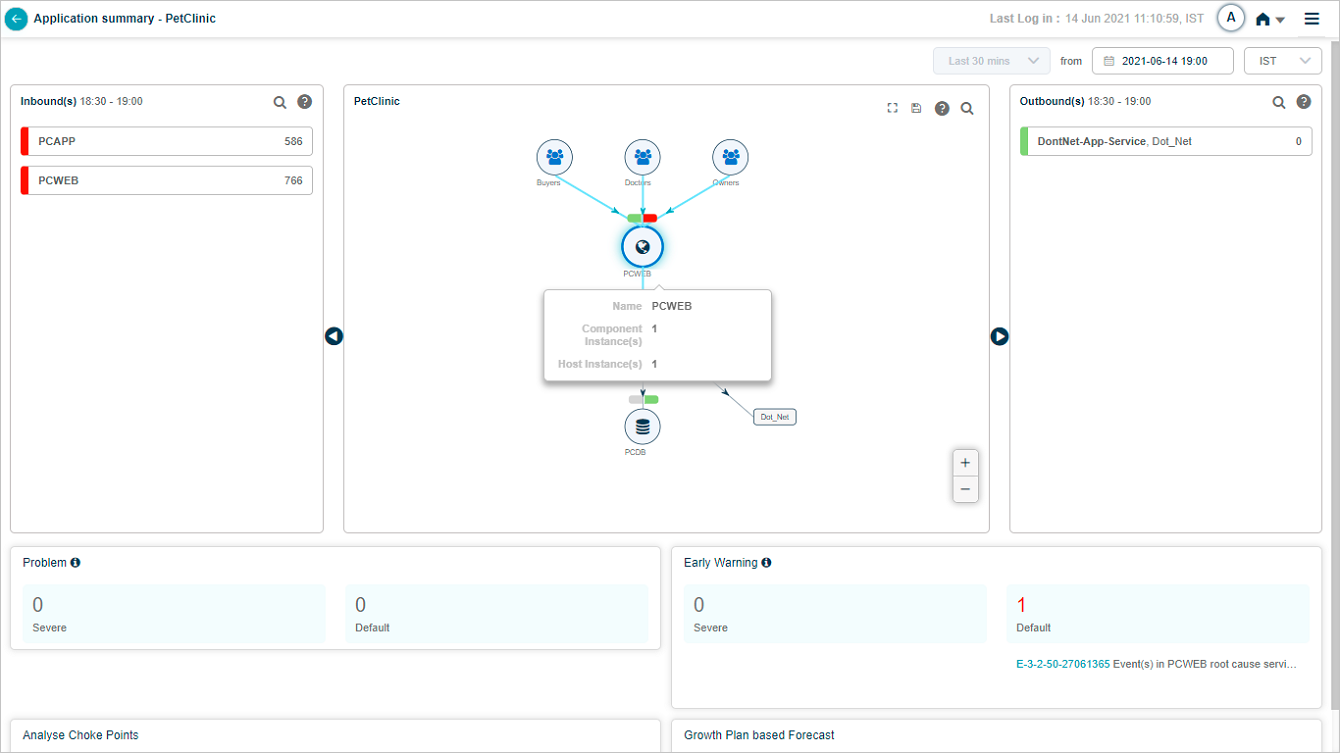
Application Health Summary
Select inside an application pod to navigate to application summary screen for a particular application.
Service Dependency Map for the selected application is displayed. Details displayed on this screen are with respect to current date and time.
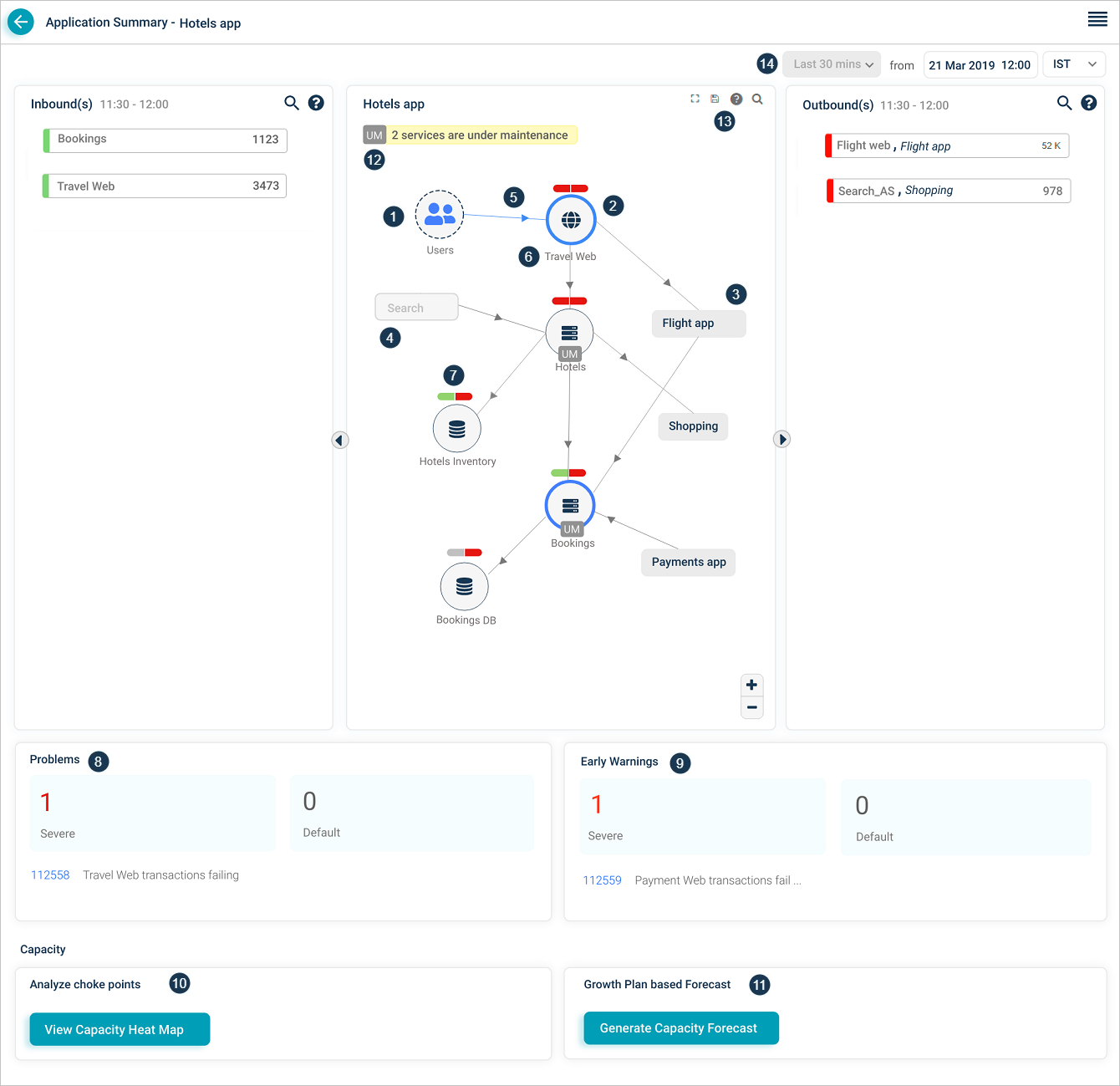
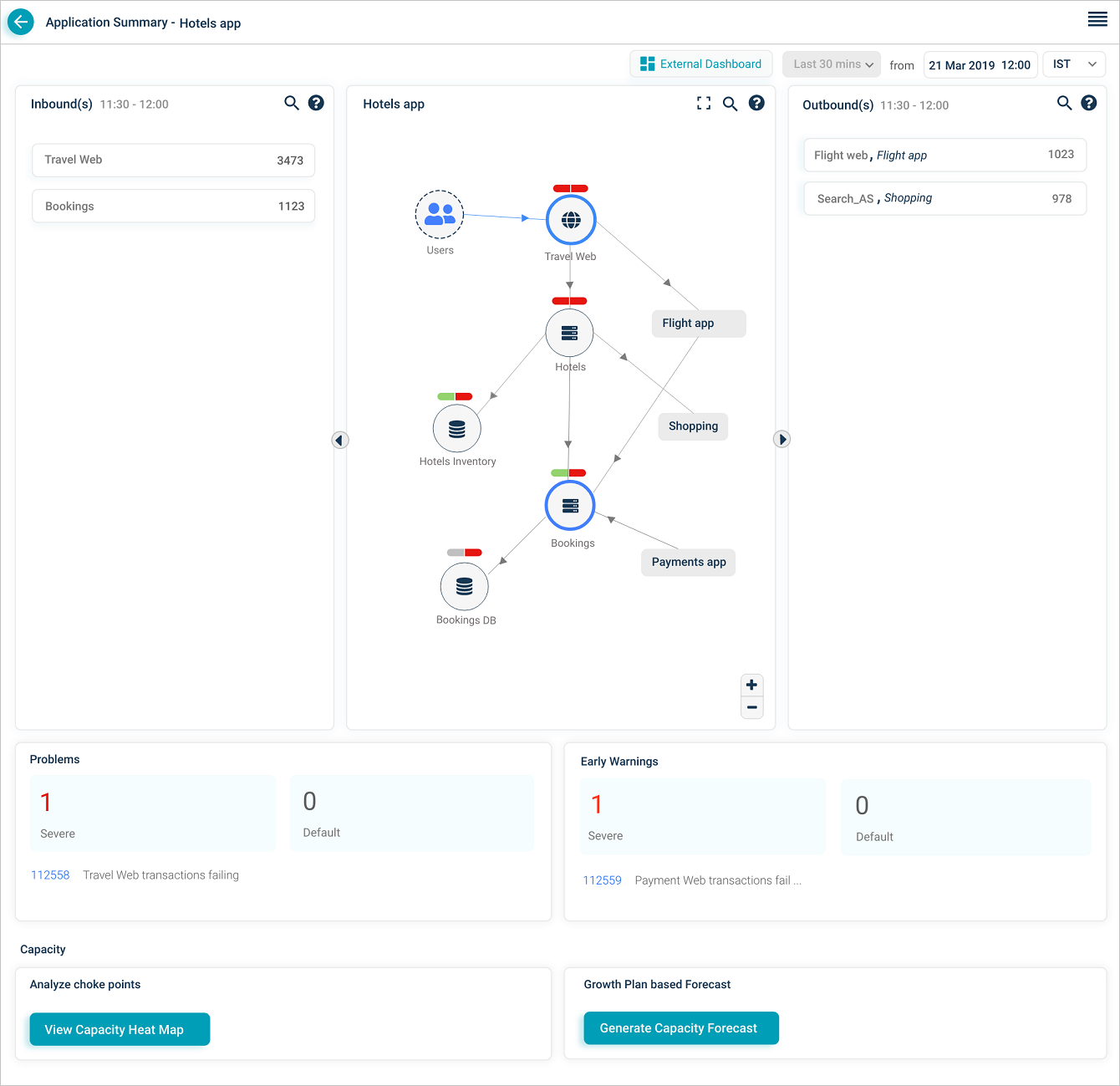
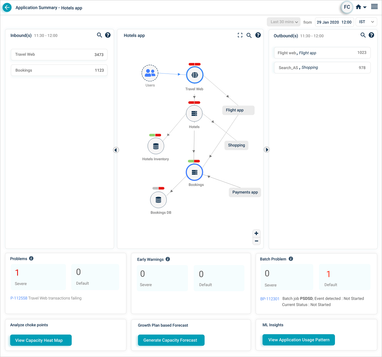
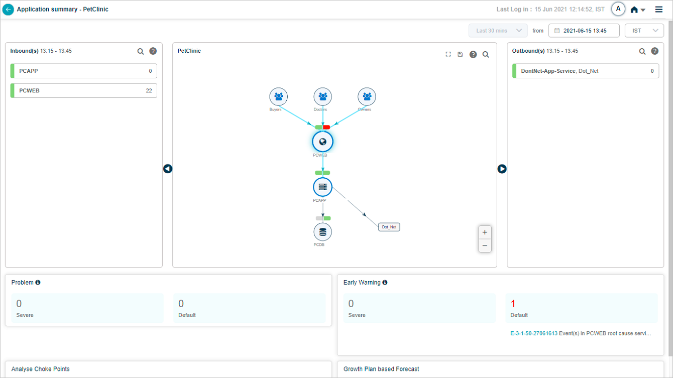
Application Summary Map
| 1 | This displays an external user or an external service. External service is an entity which initiates a transaction. |
| 2 | This displays an entry point service. A service getting requests directly from external users or external services is an entry point service irrespective of whether it is monitored by HEAL. There can be multiple entry point services per application. One entry point service can be shared across applications. |
| 3 | For a particular application, services which are part of the application are displayed along with other services and applications which are at one arm distance. If you select on an adjacent application, it becomes an in-focus application only if you have an access to it. In that case, SDM for that application appears. |
| 4 | This displays an application you can’t access. |
| 5 | This displays an Inbound to Travel Web Service. |
| 6 | This displays total of host and component instances for a service. |
| 7 | This displays a capsule which represents events on a service. Left part of capsule represents health of workload KPIs of a service. Right part of capsule represents health of behavior KPIs of a service. These capsules represent whether this service is impacted due to ongoing Signal. Application displays the capsule status accordingly. Say Problem P1, has 5 events raised and shown in it’s timeline. Say, 3 events are on service S1 and 2 events are on service S2. On S1, 1 event is on workload side and 2 are on behavior side. In this case, both the capsules are shown in red color. On S2, 2 events are on behavior side and no event on workload side. In this case, WL capsule is shown in green and BH capsule is shown in red. Left and Right parts of a capsule can be in any of these colors: Green – Indicates there are no events on a service. Red – There are events observed on a service. Grey – There is no monitoring happening on the service. Color of an icon inside the circle representing a service is not affected even if either Workload or Behavior capsule color is Red. Capsule color indicates events. |
8 9 | This section displays counts of Severe and Default problems and early warnings which are active on the application provided the end time or start time of those Signals fall in the selected time duration. It also displays their IDs and initial few words from the descriptions of those signals. You can select on any of these signals to navigate to Signal Report screen. |
10 11 | Refer 14. Capacity Forecasting |
| 12 | This displays the count of services in maintenance in an application. A complete service can be under maintenance (scheduled maintenance) or specific instances of a service can be under maintenance (ad hoc maintenance). You can see an icon with ‘UM’ for a service under maintenance. |
| 13 | Select |
| 14 | You can select previous date and time along with the time zone. Screen displays last 30 minutes data with respect to the selected date and time. |
Service instances under maintenance
If any specific instances of a service are under maintenance, it is displayed as follows.
Service Map
If a service name is longer, short service is displayed and ends with ‘…’. Hover on the short name to view the full name along with the instance count – component as well as host instance(s) count.
Service Map
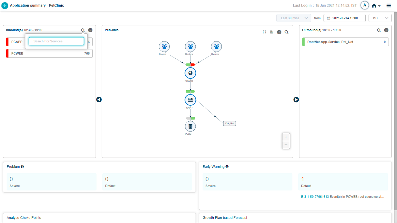
Searching Inbound or Outbound Services
Select the icon to search for specific inbound or outbound service(s). You can search for a specific service by its name or can search for a partial service name. Accordingly services display post search.
Service Map
Inbound and Outbound Transactions
Service Map
Purpose of Inbound(s) and Outbound(s) is to indicate the data flow in and out of the application.
Inbound(s) – This displays inbounds to the application. These are the entry point services to the application. Application displays data for last 30 minutes.
A particular service capturing inbound transactions is destination for these transactions.
Select on the service name to display inbound transactions for the respective service. These are the transactions at all entry point services. This displays five transactions having events raised (marked in red) in last 30 minutes followed by normal transactions. If a service does not have any transaction having an event raised, then application displays random five normal transactions.
Inbound transactions are the transactions which hit the entry point services of an application.
Outbound(s) – This displays outbounds to the application. These are the entry point services of the adjacent application. Application displays data for last 30 minutes. A particular service from where the outbound transactions originate is source for these transactions.
Select on the service name to display outbound transactions for the respective service. These are the transactions at connected services (entry point services) of adjacent application. This displays five transactions having events raised (marked in red) in last 30 minutes followed by normal transactions. If a service does not have any transaction having an event raised, then application displays random five normal transactions.
Outbound transactions are the transactions which go outside the application.
If any of the following workload metrics breach the threshold, then the respective transaction is displayed in red color.
Success: Transactions with HTTP status code in the range of 1xx to 3xx, transactions without any errors or exceptions are marked as success.
Slow: Success transactions violating the response time threshold set are considered as Slow.
Failed: Transactions with HTTP status code in the range of 4XX to 5xx, transactions with any error or exception are considered as Failed.
Timed Out: Transactions are considered as Timed out, when the request session is timed out, request or response is incomplete.
Unknown: Transactions are considered as Unknown, when the request has been initiated but the connection is closed before getting the response.
If there is an event(s) in inbounds or any failed transactions, then application displays red strip on left side in the service name box. If any of the transactions are slow, then the application displays yellow strip. If all the transactions are normal, then the application displays green strip. Preference is in the order of red, yellow, and green.
Volume
You can view volume both for a service as well as transactions associated with that service. HEAL sorts Inbound and Outbound services in the descending order of the total volume.
Average Response Time
You can view average response time for all the transactions in milliseconds (ms).
Bucket of Transactions
Show next – Application displays this option when there are more than five inbound or outbound transactions associated with a service. Select show more to display five more transactions. After this, select View All to navigate to Workload Request Dashboard to view remaining transactions.
Show less – Select to display initial five transactions.
Service Map
Hover on a service in Inbound(s) pane to view the corresponding application of which the service is part of.
Service Map
Hover on an inbound transaction to view the transaction metrics.
Service Map
For slow transactions, application displays the average response time in amber.
Service Map
Service Map
Service Map
Outbound Transactions
Outbound(s) pane displays the Service name, External application. Transactions go out from the in-focus application to this service. Application displays failed transactions count in red. If a transaction has event(s), then application displays an exclamation mark (!) in red.
Service Map
You can view slow and failed counts for every transaction in outbound services in amber and red color respectively. If a transaction has any event(s), application displays red mark before the transaction name. Select ![]() icon in Outbound(s) to view the Legend.
icon in Outbound(s) to view the Legend.
Service Map
Hovering on a transaction name in Outbound(s) pane displays the workload metrics counts.
Service Map
Transaction Metrics
Select on a capsule to view the transaction metrics as displayed follows. It displays the volume trend of transactions. It displays count of failed, slow, timed out, unknown, and success transactions. It displays details about five recent events like metric name, instance, timestamp, metric value, and threshold.
Transaction Metrics
Hover on a data point in Volume Trend (Count) graph to view the total volume of all inbound transactions for the respective service.
Volume Graph
Transaction Metrics
Select View to get the details on Forensics.
Forensic Details
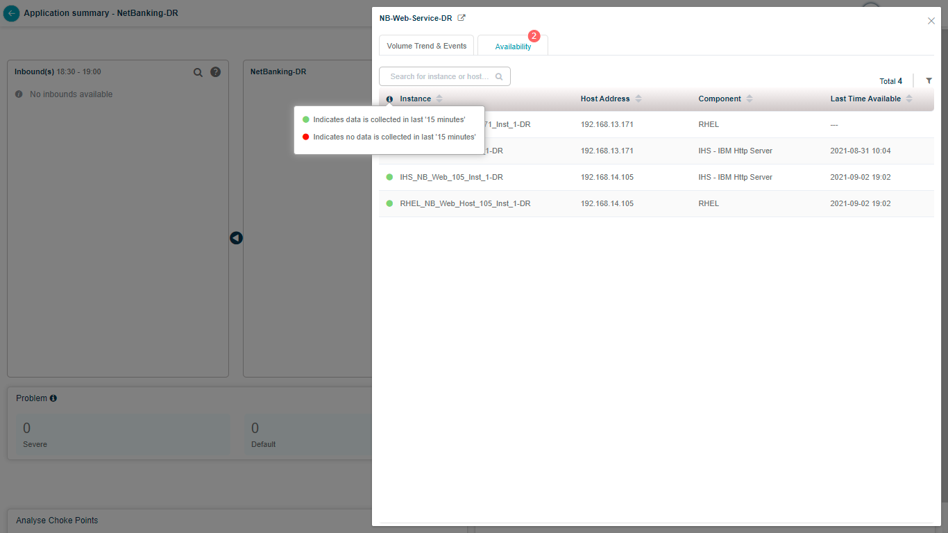
Server Availability
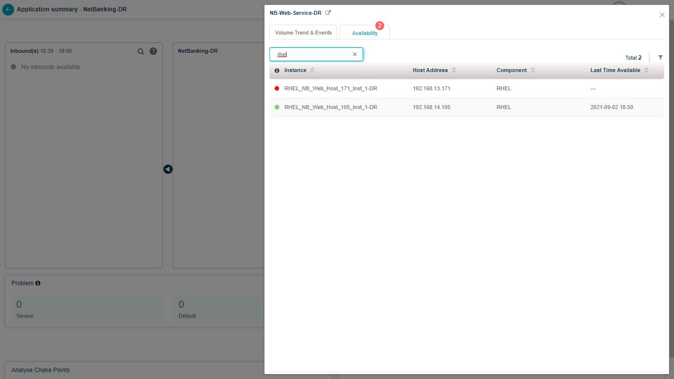
Select Availability. You can view names of all the host and component instances, types of the components, names of the services to which the instances belong to, address of the host on which you deploy the components, last date and time when component agent did data collection for the KPIs of the instances. Measure of the last time available is with respect to last 15 minutes. You see the list of all the available instances in a specific server. You also get status about the availability of the instance.
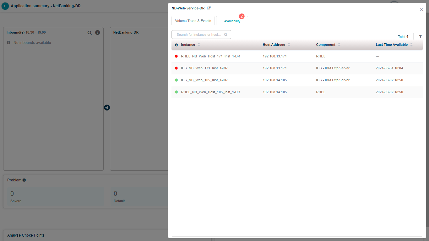
Navigate to Server Availability
Instance Data Details
You can search for specific instances by full or partial instance name.
Instance Data Details
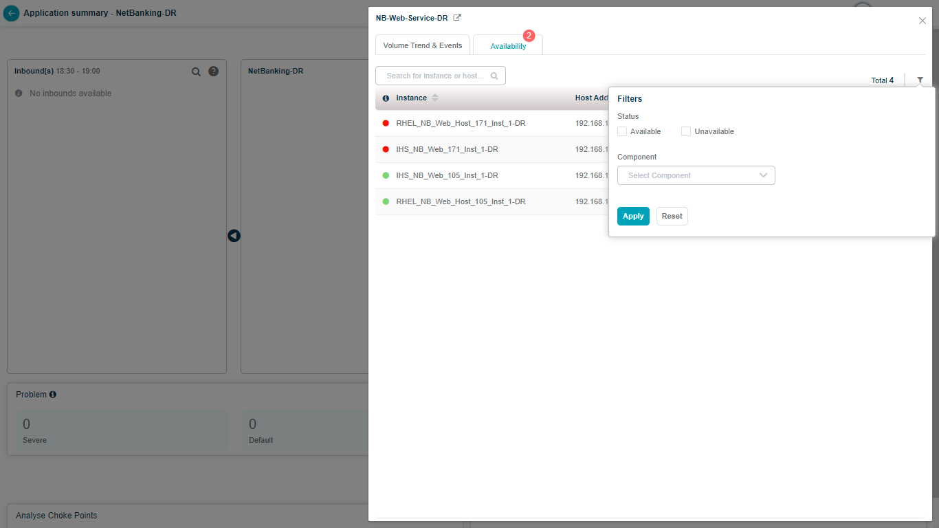
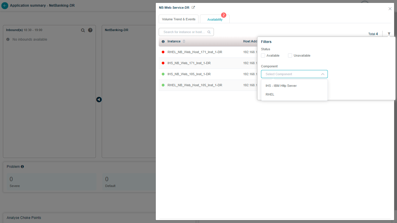
You can filter the data for viewing the server details per your criteria.
Instance Data Details
Instance Data Details
Refreshing the Details
Auto Refresh
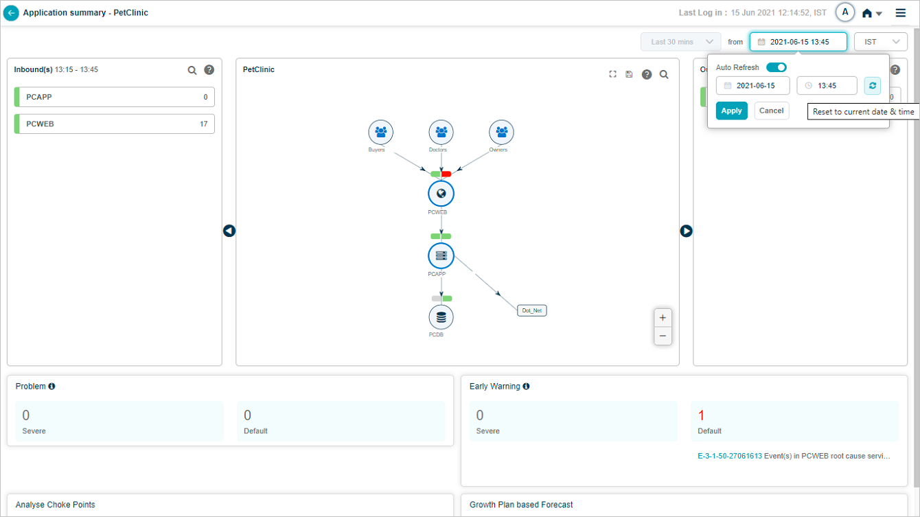
Auto Refresh
Date time at top right are displayed as a link. Tooltip showing Auto Refresh and Reset buttons appears on hovering over the link. You can enable or disable the auto refresh using the slider. If enabled, details on the screen are automatically refreshed every ten minutes. Auto Refresh gets enabled on select of Reset button if it was earlier disabled.
Manual Refresh
Select on the Refresh button next to Auto Refresh to manually reset date and time to the current. You can anytime select on this button to refresh the details on the screen.
Help Icon
Select on the help icon (![]() ) to see the entities representation.
) to see the entities representation.
Map_Legands
External Dashboard Link
Application Summary Map
If you create a dashboard in Grafana for an application in HEAL, you can view External Dashboard link to navigate to the Grafana dashboard related to the current application from Application Health Summary screen.

Application Summary Map
Batch Enabled
If you enable a batch, HEAL displays counts of Severe and Default batch problems which are active on the application provided the end time or start time of those Signals fall in the selected time duration. It also displays their IDs and initial few words from the descriptions of those signals. You can select on any of these signals to navigate to Signal Report screen.
Batch Enabled Map
ML Insights
If you configure Workload Signature Display from the backend, you can view the application usage pattern in HEAL. Select View Application Usage Pattern for the same.
Connection between the Services
Hover on a service icon (round circle) to highlight the incoming and outgoing connections for a specific service.
Services Map