How Can We Help?
To observe the Capacity Heat Map for your application, follow the steps below:
1. Navigate to the Application Summary page, and see Application Summary Navigation.
2. Select the “View Capacity Heat Map” option.
This map displays a weekly trend, representing the frequency at which infrastructure or application-level capacity approaches the configured resource limits. It’s important to note that only Capacity KPIs are used to establish Capacity baselines. Each Capacity KPI denotes a resource limit within the application’s infrastructure or code.
- CPU: KPIs associated with CPU consumption.
- Memory: KPIs linked to Memory consumption.
- I/O: KPIs that record I/O levels.
Application Level Capacity:
- Application: KPIs that record virtual resources such as thread pool, DB Connection Pool, DB locks, and DB sessions.
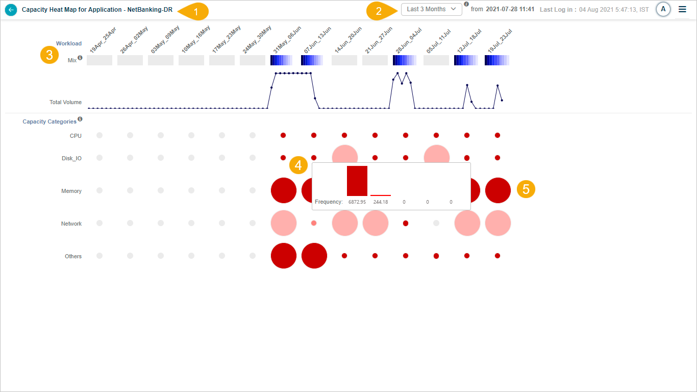
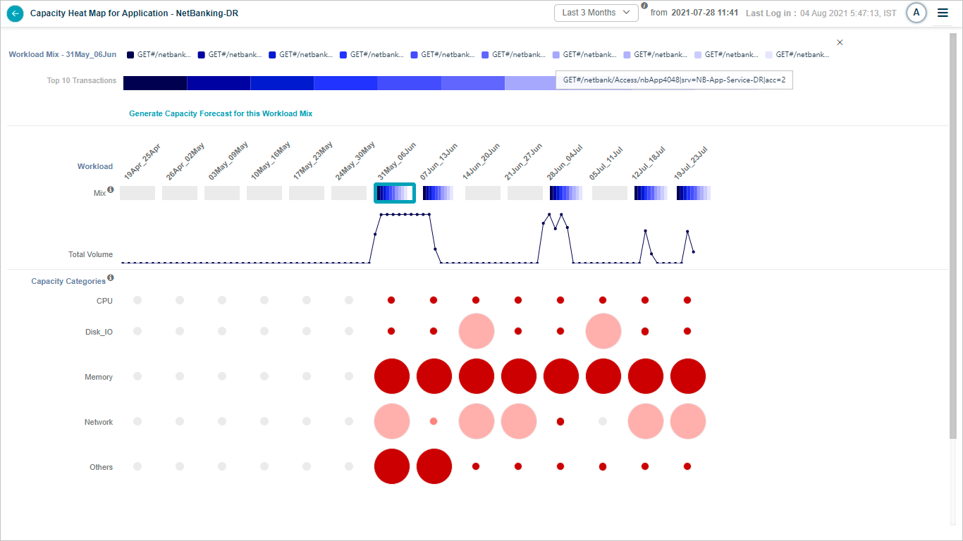
Capacity Heat Map for Application
| Field | Description |
|---|---|
| 1 – Application Name | The name of the application is represented in the Capacity Heat Map. |
| 2 – CF Baseline Timestamp | The Heat Map is generated to the timestamp of the last completed CF baseline generation. By default, the duration is set to the number of months for which the CF baseline was last generated. Viewing options include data for 1, 2, or 3 months. For instance, if a CF baseline was executed for 2 months, the application will load data corresponding to those 2 months. The baseline starts from the displayed date and time and covers the past 60 days. During the CF baseline operation for 1, 2, or 3 months, if data for a particular month is not accessible, the application will show a zero-data status for that week. |
| 3 – Workload Mix | Workload Mix refers to a combination of transactions of diverse types. It illustrates the volume growth over specific data points according to the chosen time range. This feature presents the composition of the top 10 transactions using a stacked bar graph. |
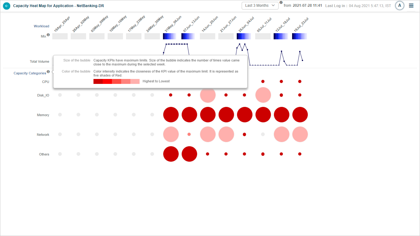
| 4 – Bubble Size in Capacity KPIs | The size of the bubble in Capacity KPIs indicates the frequency, i.e., the number of instances when a KPI value approached its maximum limit within a week. Capacity KPIs have predefined maximum and minimum boundaries. When you hover over a bubble, HEAL presents five frequency ranges or ‘buckets.’ The first bucket represents the most severe frequency, while the last denotes the least severe. |
| 5 – Bubble Color in Capacity KPIs | The color of the bubble in Capacity KPIs represents the intensity, which corresponds to the proximity of the KPI value to its limit. This intensity is portrayed through five shades of red, with a darker shade indicating greater closeness to the limit. |
Interaction with Heat Map
1. Baseline Run Months: To view the months during which the baseline run occurred, hover over the information icon. This will be illustrated on the screen that follows.
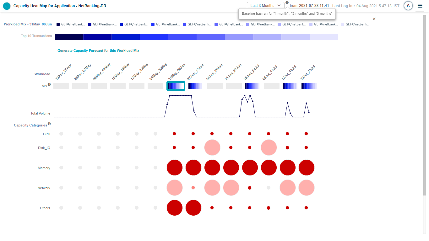
Baseline Run Months
2. Total Volume Graph: This graph displays the accumulated total volume of all transactions for each day. When you hover over a point on the graph, it will show the date and the average volume for that specific day, providing a quick and insightful overview of transaction volumes.
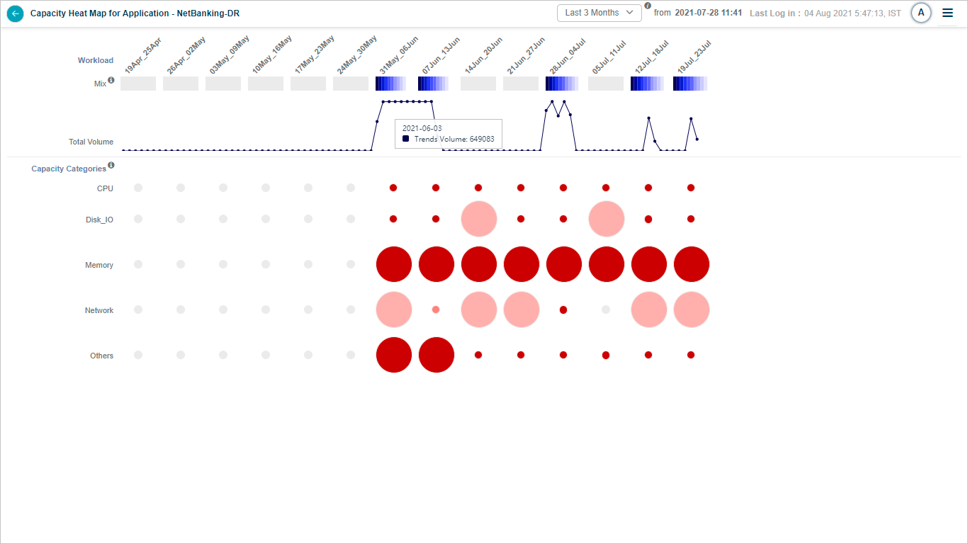
Total Volume Graph
3. Month Selection: You can select the first, second, or third month in relation to the date and time, as shown in the subsequent screen.
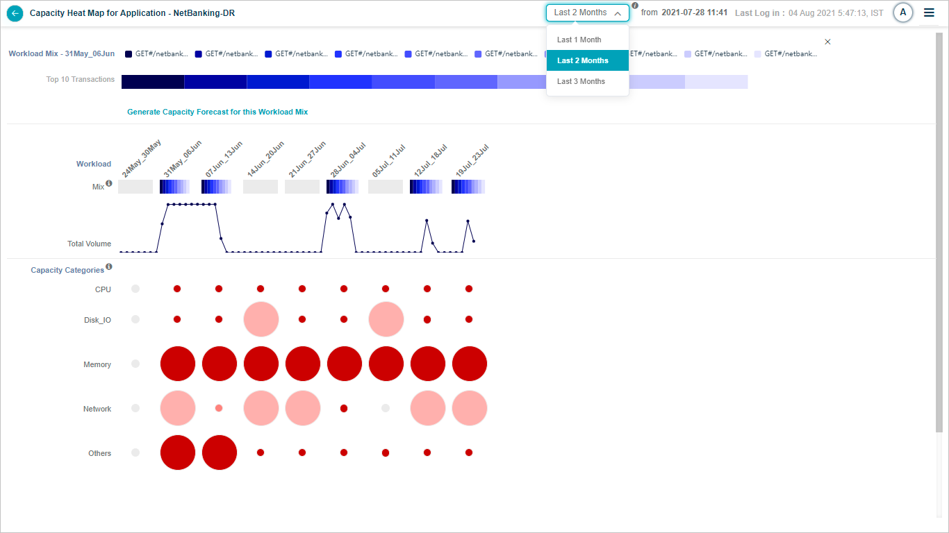
Month Selection
4. Disabled Month: If no MLE baseline is conducted for a particular month, that month will be disabled.
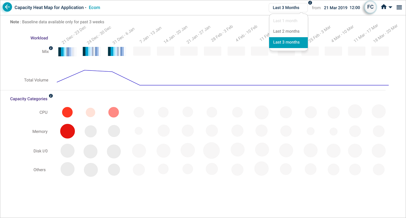
Disabled Month
5. Bubble Selection: Selecting a bubble in the Heat Map will cause a pop-up, as demonstrated on the next screen. This pop-up will display:
- A list of services for the application. You may select a service to view its details.
- A list of all instances that belong to this service.
- A breakdown of heat for each host and component-level capacity KPI for this capacity limit.
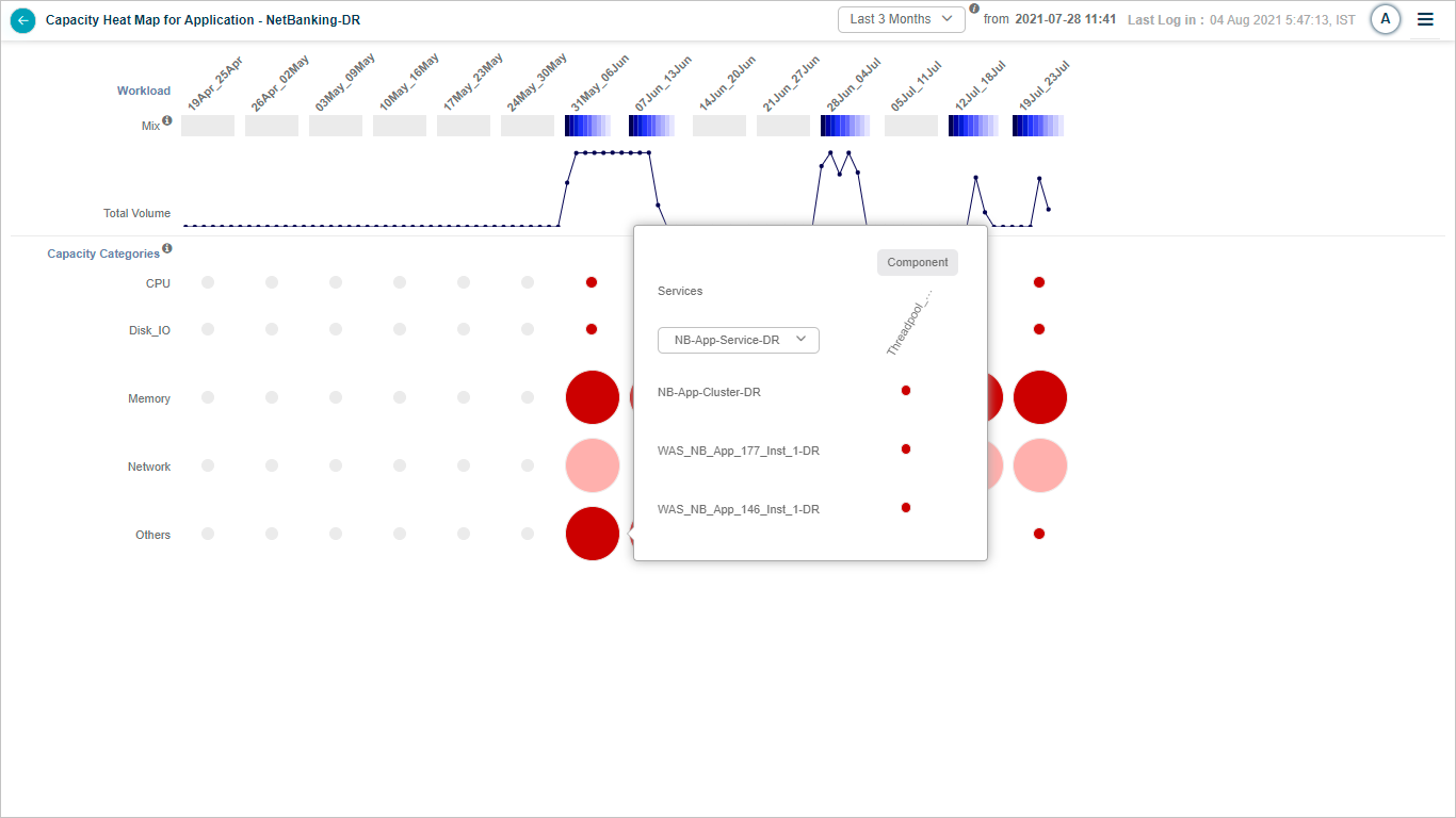
Bubble Selection
6. Instance-Level Bubble: Hovering over a bubble at the instance level will display a pop-up, as shown below.
This pop-up will display:
- The name of the service instance.
- The name of the Host or Component-level KPI.
- The frequency of the KPI.
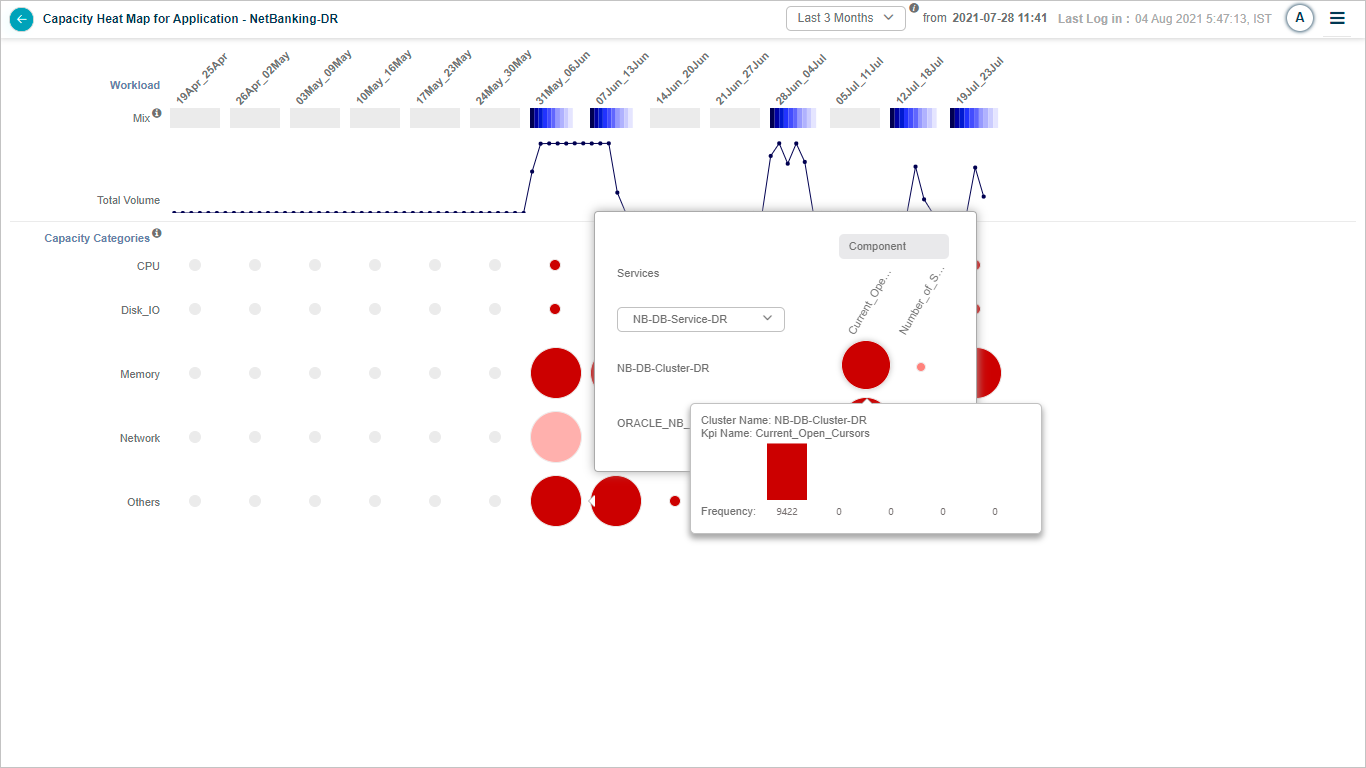
Instance-Level Bubble
7. Transaction Mix Selection: You can select a specific transaction mix for in-depth analysis during a particular week. This will display the top ten transaction names in a stacked bar graph for the selected week. Hovering over a transaction will display the average weekly volume for the specific transaction. It will also display the average response time in milliseconds for the transaction.
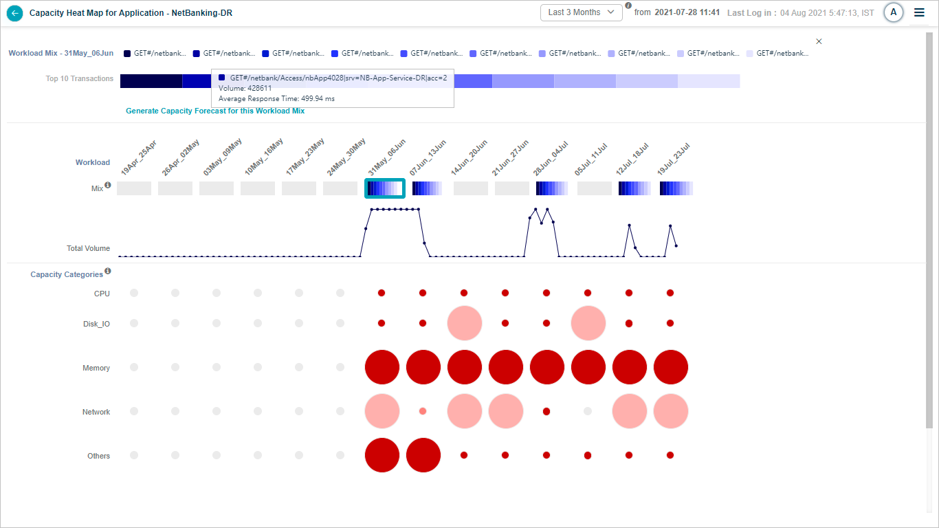
Transaction Mix Selection
8. Workload Mix: Hovering over a partial transaction name in the Workload Mix will display the full name of the transaction.
Workload Mix
9. Information Icon in Mix Section: To view more details, hover over the information icon in the Mix section. This action will bring up the screen that follows.
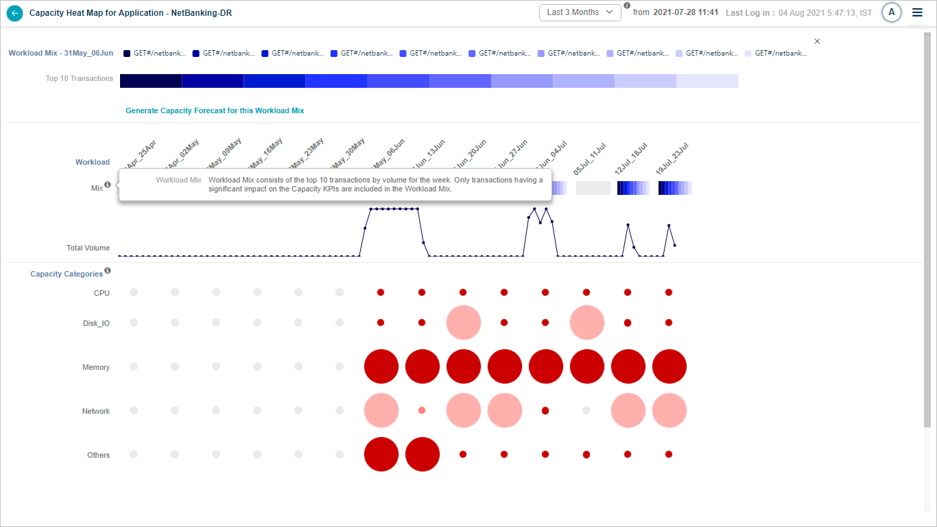
Information Icon in Mix Section
10. Information Icon in Capacity Categories Section: Hovering over the information icon in the Capacity Categories section will display the subsequent screen.
Information Icon in Capacity Categories Section